Inspiration
During the logo design process I had a pretty clear idea in my head of how I wanted it to turn out. However, choosing the right font was a more abstract challenge for me. I knew I wanted to lean more into a vintage science fiction direction.
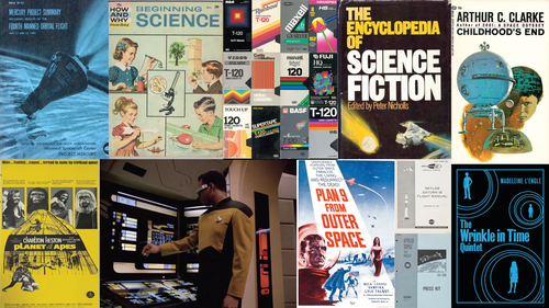
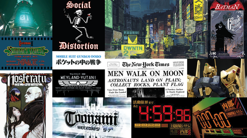
This direction might seem to clash with the logo I designed in my last post, but I’ve always found it cool to juxtapose clean and modern typography with more caligraphic elements. This combination shows up a lot in anime and other science fiction where English and traditional Japanese characters (hiragana, katakana, and kanji) are mixed together.
There were also two technical limitations that I wanted to follow:
- Use a set of variable fonts for my redesign (I even wrote a blog post about this way back in March of 2020).
- Pick a series of fonts that would comply with the guidelines from neurodiversity.design.
Candidates and Choices
I needed three font families: a display font for headers, a flexible and readable option for body copy, and a monospace font for code blocks.
Two site I like for finding variable fonts are v-fonts.com and Google Fonts. V-Fonts is especially cool because fonts are filterable by licenses for open source or free commercial/non-commercial use.
After looking through pages and pages I narrowed my selection to two for each category.
Display Font
For headers I was between Science Gothic, a sans serif art deco font, and Fraunces, an art nouveau serif font.
 |  | |
|---|---|---|
| axis(es) | weight (wght)width ( wdth)y opaque ( YOPQ)slant ( slnt) | optical size (opsz)weight ( wght)soften ( SOFT)wonk ( WONK) |
| size | 653 KB | 230 KB 190 KB (italic) |
| ligatures | no | yes |
I ultimately chose Science Gothic for a few reasons. I liked Fraunces because retro-ish serif fonts are currently having a moment, but was worried that choosing something trendy would date the design in a few years when industry tastes moved onto something else. I was also a little hesitant that the serifs would clash with the brush style of my logo, I wasn’t completely sold on the lowercase “f” and “j” characters. Overall I really wanted to work Science Gothic into the design since its been on my font radar for a few years and I think there’s a lot of cool variation combinations that can be made.
This decision did involve a performance tradeoff - Science Gothic is about 200 kilobytes larger than Fraunces’s regular and italic versions combined. While 200 KB is a significant amount of data to transfer over the network, I factored this into my subsequent font selections.
I also think that Science Gothic probably scores better on the neurodiversity.design criteria than Fraunces does.
See an interactive font specimen of Science Gothic here.
Body Copy
For the site’s main text I wanted to maximize accessibility by following the typography and font NDS guidelines. This meant finding a sans serif optimized for small and large screens. I narrowed down two choices to IBM Plex and Inter, both of which were specifically designed for digital user interfaces.
 |  | |
|---|---|---|
| axis(es) | weight (wght)width ( wdth) | weight (wght)slant ( slnt) |
| size | 106 KB 122 KB (italic) | 786 KB |
| ligatures | yes | no |
I chose IBM Plex, largely because of the file size. Even with separate regular and italic files their combined size was less than 30% the size of the single Inter file. As a bonus, the Plex font had some ligature letters including my favorite which is the “fi” grouping.
I did some digging into why Inter was so huge and found that contained of tons of (albeit cool) glyphs I didn’t forsee myself using. Since it did include some very nice contextual alternates I did consider using it for the code block font, but I was afraid that since it didn’t come with a true monospace setting too similar to the regular body text.
See an interactive font specimen of IBM Plex here.
Code Blocks
My two choices for code blocks were Recursive and Fira Code. I had previously used Fira Code as my daily editor font, so considering it for my website felt like a natural choice. Like Inter, Fira Code includes numerous programming-specific ligatures.
 |  | |
|---|---|---|
| axis(es) | monospace (MONO)casual ( CASL)weight ( wght)slant ( slnt)cursive ( CRSV) | weight (wght) |
| size | 284 KB | 280 KB |
| ligatures | no | yes |
The main reason picked Recursive over Fira Code was the same reason I stopped using it as my editor font — the more I used the fancy ligatures the more confusing they felt. I’d heard similar feedback from readers who were puzzled by ligatures in blog posts, like mistaking the ”⇒” character for a special symbol rather than a joined ”=” and ”>“. Recursive offered additional benefits through its variation settings for casual, cursive, and slant properties, which let me emulate Wes Bos’s approach of using script fonts for code comments. For only 4 kilobytes more file, Recursive just had a lot more flexibility to offer.
See an interactive font specimen of Recursive here.
Maximizing Performance
With these three variable fonts, I have a total of 1165 kilobytes (1.165 megabytes) of font files for my site - and that’s a lot of bytes.
While fact checking this post, I realized I made a mistake — The version of Science Gothic I’d been using for these comparisons had already had some of its axes removed using a tool that I talk about later in the post.
For comparison, the last fully-designed version of my site from 2018 used Dosis (27KB) and Raleway (21KB). Even if I had loaded multiple weights - say three for Dosis (light, medium, bold) and six for Raleway (the same three weights plus their italic variants) - the total would have been around 207KB, assuming similar file sizes for each variant.
The Best File Types
At the time of writing this .woff2 (Web Open Font Format 2) is generally the best file type to use for self hosted font files. Luckily IBM Plex and Recursive were already available in this format, but Science Gothic needed to be converted. I found a cool CLI tool called glyphhanger that made this conversion quick and easy.
glyphhanger --formats=woff2,woff --subset=ScienceGothic.ttfThis output a file with the overall same size, but because of the more modern format it can be compressed up to between 30-50% better, transmitted more efficiently, and has wider overall browser support.
| before | after | reduction |
|---|---|---|
| ScienceGothic.ttf (1.41 MB) | ScienceGothic.woff2 (1.41 MB) | 0% |
Subsetting
Subsetting creates a new font file containing only specified characters from the original font. glyphhanger can also help with this. Two of the fonts — Science Gothic and IBM Plex — included complete Cyrillic alphabets and other glyphs I wouldn’t need for English-language web content. To make the files as small as possible I removed all but the Latin letters and symbols.
glyphhanger --subset=*ScienceGothic*.ttf --LATINThis knocked a dramatic number of kilobytes off all three files!
| before | after | reduction |
|---|---|---|
| ScienceGothic.woff2 (1.41 MB) | ScienceGothic.woff2 (279 KB) | 80% (wow!) |
| IBM-Plex-Sans.woff2 (106 KB) | IBM-Plex-Sans.woff2 (59.6 KB) | 44% |
| IBM-Plex-Sans-Italic.woff2 (122 KB) | IBM-Plex-Sans-Italic.woff2 (70.8 KB) | 42% |
Removing Variable Axes
While the subsetting significantly reduced file sizes, the combined total was still over 400KB - almost double my previous font stack. The last step I could think to take was removing unused variation axes. glyphhanger couldn’t do this, but I found another tool called slice that allows you to edit variation settings. By setting the min, max, and default values all to 0 that axis can be removed entirely.
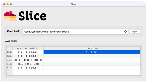
I took a hard look at what styles I thought I would actually use and ended up removing the slnt axis from Science Gothic, the slnt and MONO axes from Recursive (meaning the font will now always be monospaced), and because the “italic axis” or IBM Plex was a separate .woff file I removed it altogether.
| before | after | reduction |
|---|---|---|
| ScienceGothic.woff2 (279 KB) | ScienceGothic.woff2 (182 KB) | 35% |
| Recursive.woff2 (285 KB) | Recursive.woff2 (117 KB) | 59% |
| IBM-Plex-Sans.woff2 (59.6 KB) | IBM-Plex-Sans.woff2 (59.6 KB) | 0% |
| IBM-Plex-Sans-Italic.woff2 (70.8 KB) | removed | 100% (lol) |
Browsers have the ability for any font to force oblique styles using font-style: italic (and event though the graphic designer in me knows this is considered the wrong thing to do), I decided the performance benefit outweighed the nicer letter forms.

This takes my total size down to 358.6 kilobytes, still larger than my ~200KB existing font stack, but I can live with it. It’s whopping 806KB, or 69%, less than the four variable fonts I started with.
Skipping These Fonts All Together
359 KB is still a pretty big ask, and I recognize the potential that anyone on a slow connection might not want to download them.
For a few years there was a proposal what would allow users to set a prefers-reduced-data setting on their device, and then through a combination of using media="(prefers-reduced-data: no-preference)" in the HTML and @media (prefers-reduced-data: no-preference) in the CSS I could skip loading these fonts entirely. This feature currently is experimental and supported by no existing user agents because of concerns it could be used as “a source of fingerprinting, with a bias towards low income with limited data.”
Without the ability to query this preference I don’t know of any other way to not load these fonts, but like I explored in my previous post the best way is to set the appropriate font-display value. I do intend to set some reasonable fallback fonts for when the swap period runs out and these larger font files don’t load, but I need to get further into the design process before I can start matching those to my final type styles.
Progress on the New Site
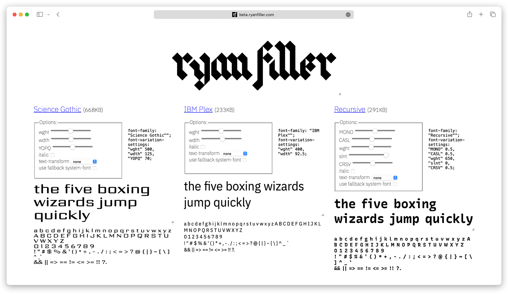 Follow along with my redesign at beta.ryanfiller.com (which may or may not currently match what is shown at the time of publishing this blog post.)